Michel
After 100 years of success, the German forwarding company Michel commissioned us to modernize their logo. The original idea of the dynamic letter "M" should be retained. The new logo has allowed Michel to visualize the innovative aspect of the company. Subsequently, new truck tarpaulins, business cards, calendars, stationery and stickers were designed with the logo and pattern.


Solid brand strategy. Data-based design solution.
target oriented brand-refresh.
target oriented brand-refresh.


Logo Design
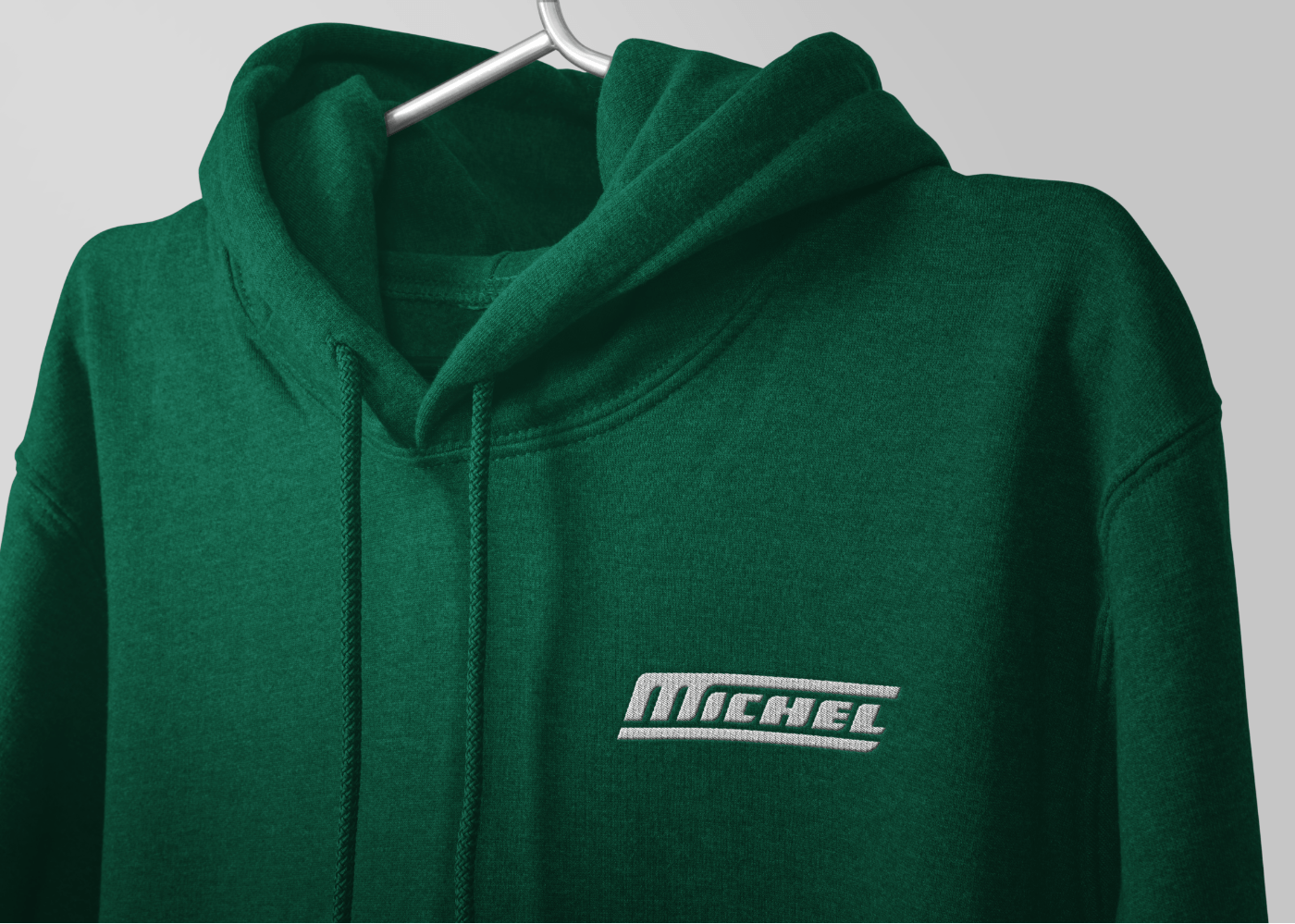
A good logo is key to successful branding. Even though the logo is just a part of the company’s brand, it is the first thing any potential customer will look at. Henceforth, we ensured that the logo redesign lays the foundation of the entire narrative on which its brand is built. It has the recognizability and the character of the old one, yet it looks towards the future. The new Michel logo is used on all sort of diverse branding materials as business cards, calendars, stickers, uniforms.


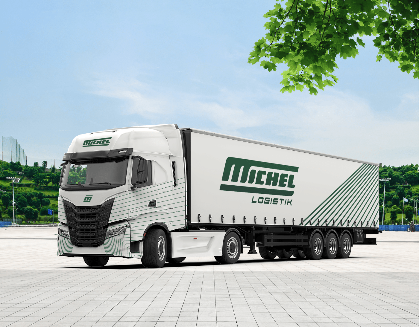
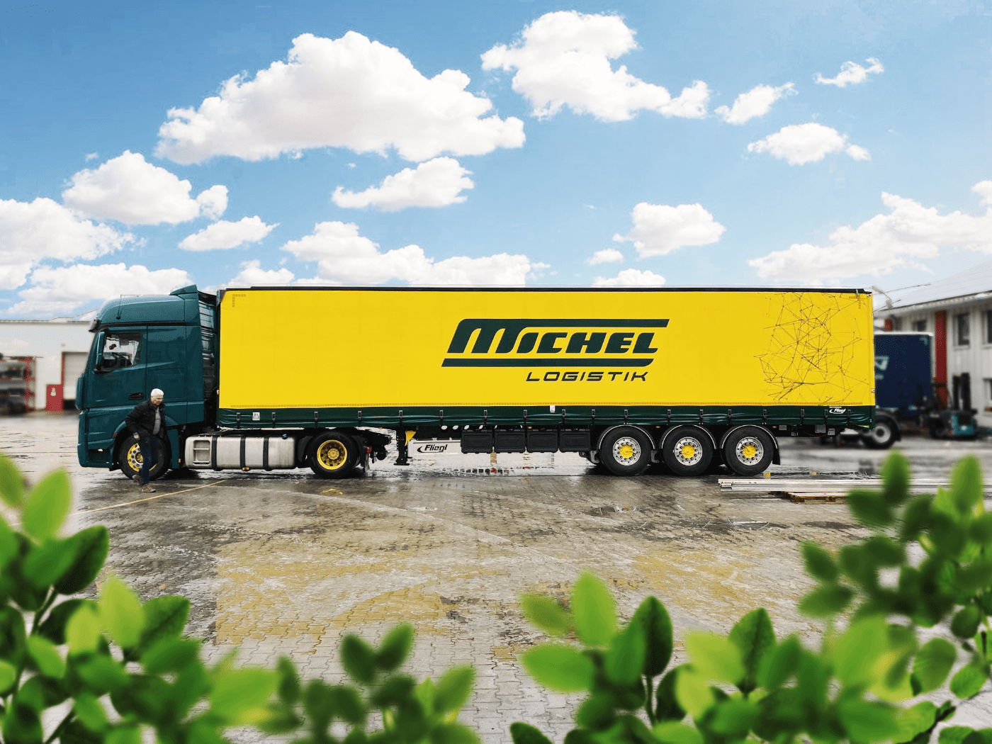
LKW Design
The branding is used for the design of the Michel trucks. Their look is clean, modern and recognizable. The original color combination of yellow and green is used for the logistic trucks. A geometric line pattern shows the road network. The white truck design is incorporating a more modern and clean look. It is used for food transport.